packaging system
dog & cat natural chews
proof of concept
-
The Ask.
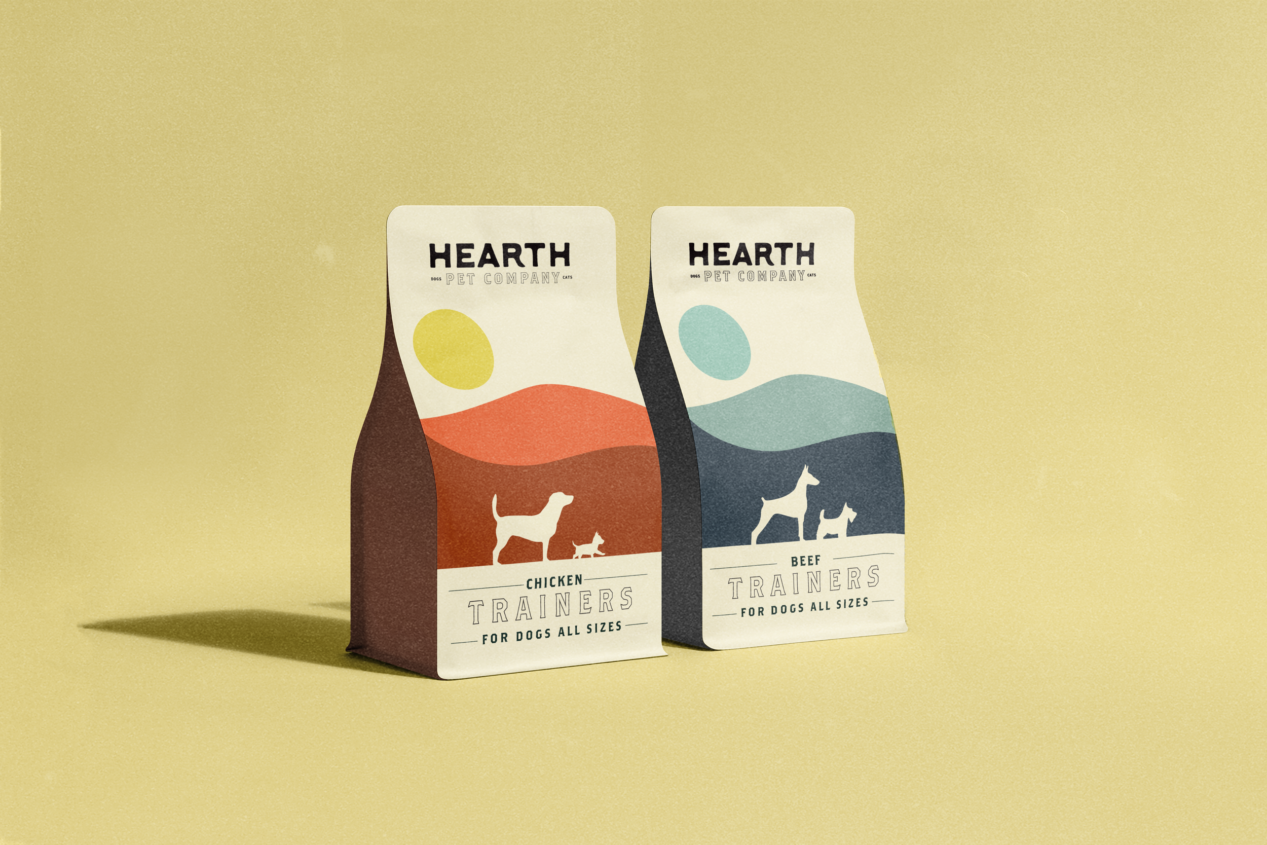
Create a Look-And-Feel for a dog and cat line of treats. The design needed to have the capacity and flexibility to iterate out for future yet-to-be created products. It also needed to convey the brand’s focus of being a natural product line that was approachable, modern, and professional.
-
The Solution.
I designed a clear typographic hierarchy with the name of the product as the focus in a consistent lockup. To easily differentiate products, I created abstract shapes, inspired by geography and nature. The usage of various color palettes, as well as silhouettes, cue the customer to the various options of sizes within that product line. The imagery was flexible in design so that new elements could be created easily for new launches.
-
The Outcome.
In an industry full of either staid design or too cutesy to convey quality and expertise, the system feels both fresh and polished. Making sure the typography, fonts, images, color palettes and hierarchy were used wisely, I created a line that has clarity between the many products and their various sizes while holding the potential of many iterations in the future, when needed.
Role: Designer
scope: Packaging