
ODE SKINCARE/ ode oasis CBD
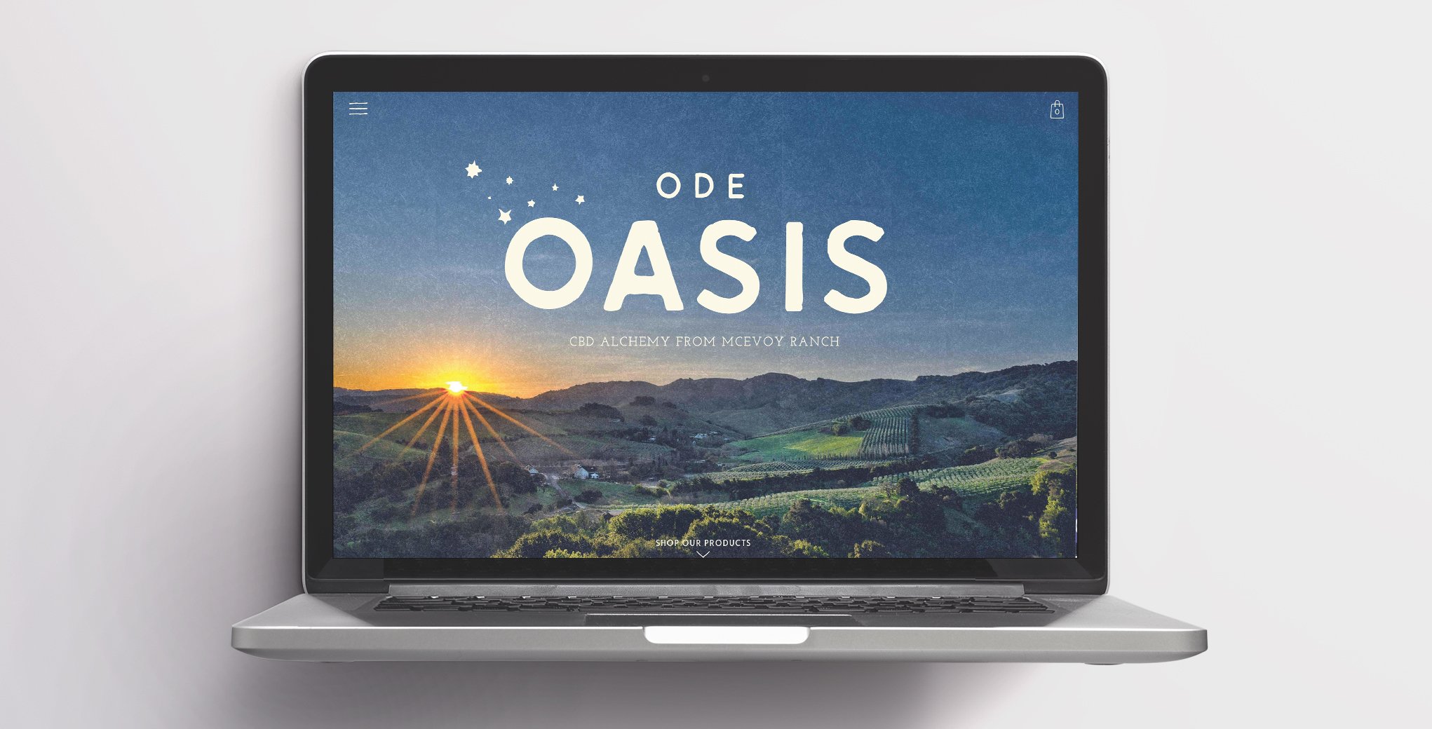
When Nan McEvoy noticed the worn hands of her ranch workers, it troubled her so much that she had a healing balm created just for them utilizing their premium McEvoy olives. A clean beauty line was soon born, with Oasis CBD being their newest, boldest product yet.
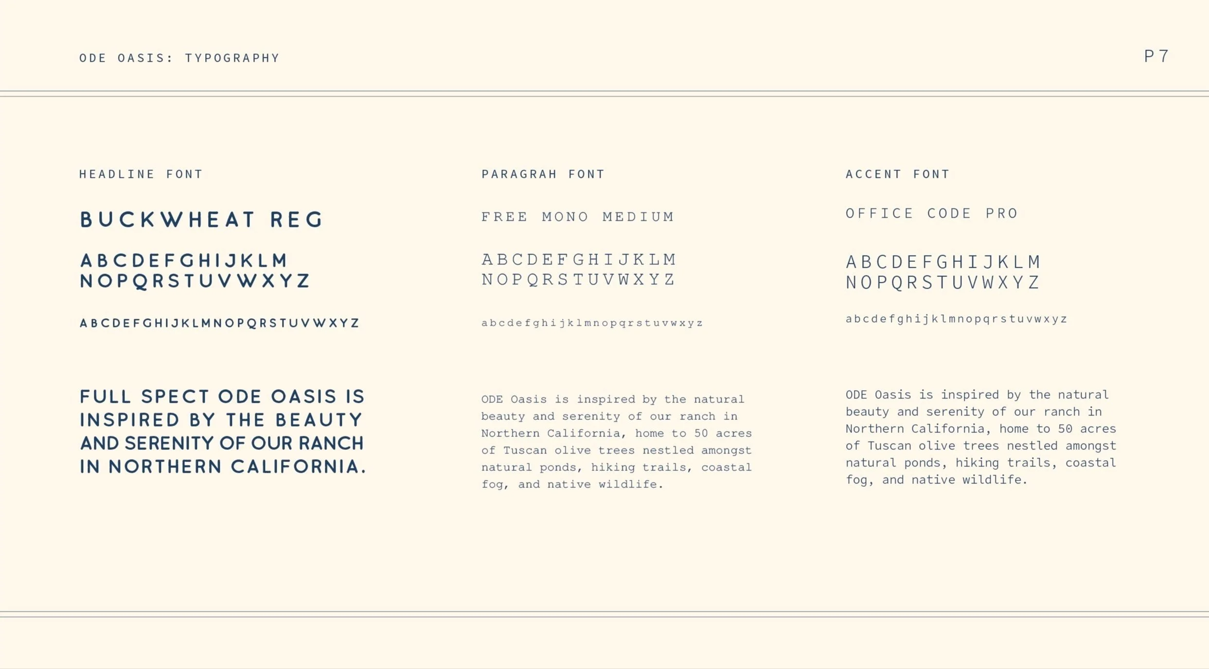
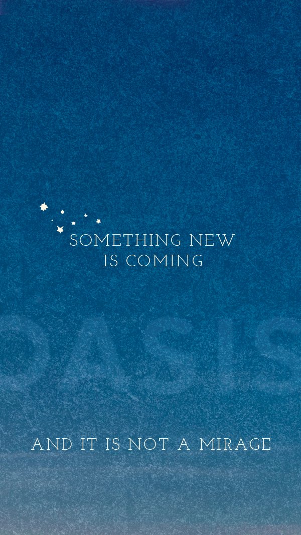
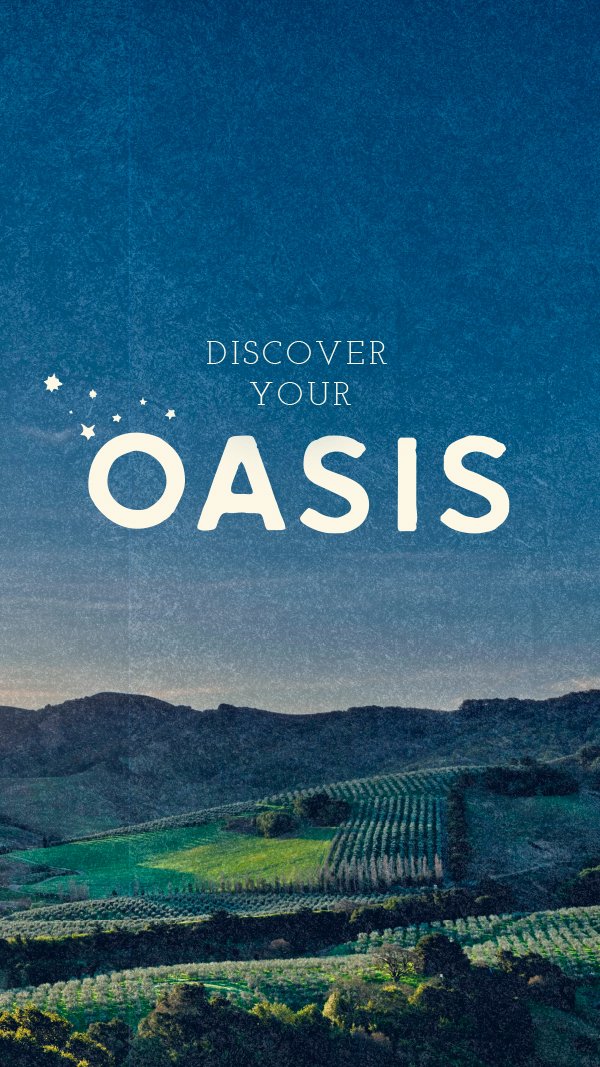
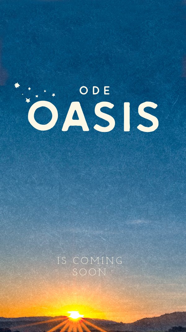
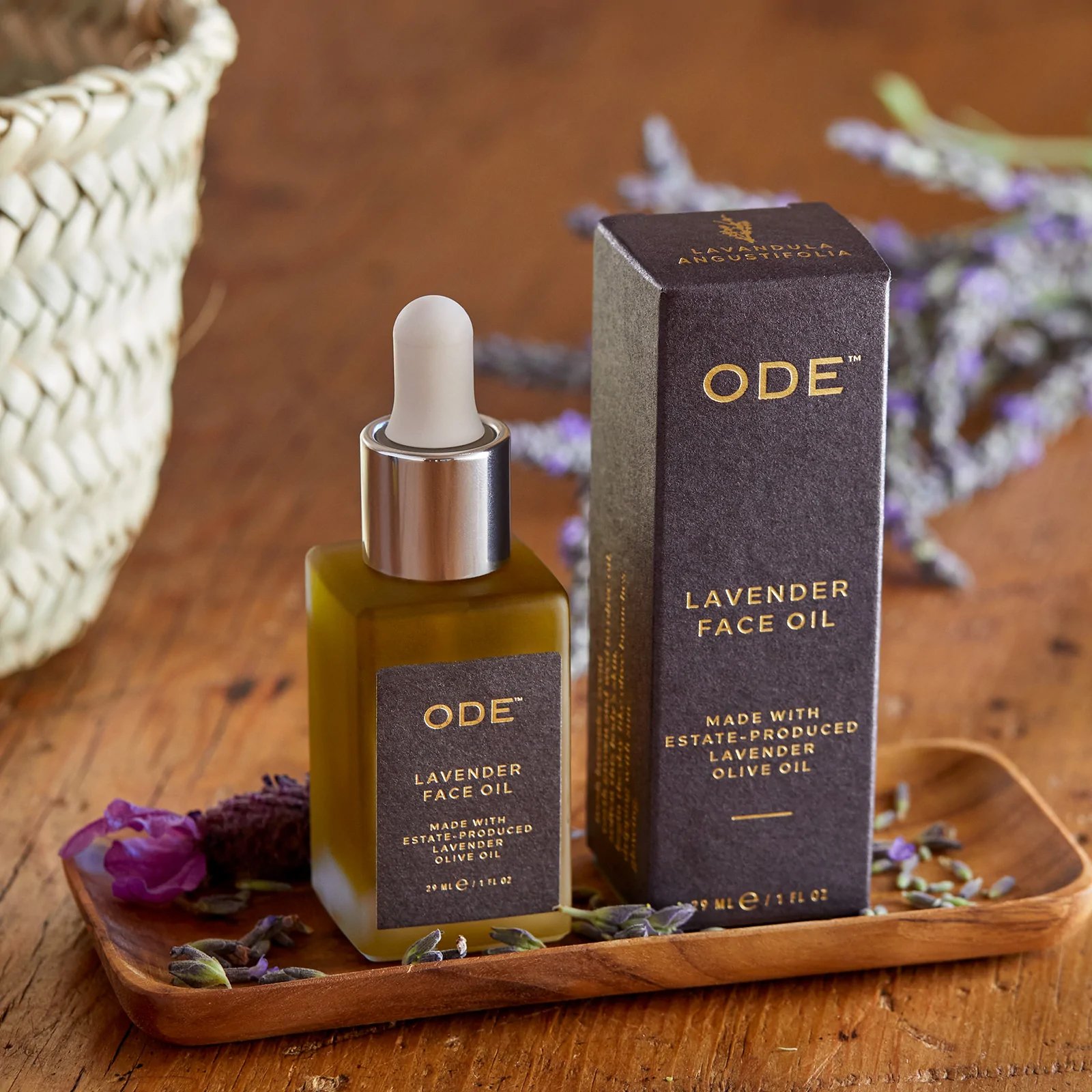
ODE Skincare’s past branding explored “ranch” and “luxe,” but they had either skewed too homespun or spun too high-end, without capturing its depth. Through careful selection of packaging elements—premium, textural paper; gold embossed, delicate typography—McEvoy now had a more substantive, soulful expression of their brand that was not only visual, but experiential.After walking the ranch and witnessing first hand the McEvoy’s land stewardship, the name “Oasis” truly came to life. It not only evoked the state of mind when using their CBD products; it also described their 240-acre ranch in all of its timeless, sensual etherealness. I began my process by pulling inspiration from the beauty of the nearby Pacific Ocean, the ancient oak trees, and even the mesmerizing, gray fog of the Petaluma Gap. Oasis deserved an ownable look that would be as calming and elegant as Marin itself.role: Creative Director
scope: Visual Identity, Packaging
ranch photography: Don Hicks III